30. Juni 2009

RDFa

Das hier ist eine wirklich gute Einführung in RDFa: Introduction to RDFa.

The web is designed to be consumed by humans, and much of the rich, useful information our websites contain, is inaccessible to machines. People can cope with all sorts of variations in layout, spelling, capitalization, color, position, and so on, and still absorb the intended meaning from the page. Machines, on the other hand, need some help.

Eine sehr gute Einführung. Wer sich für das semantische Web interessiert, sollte RDF und RDFa kennen.

29. Juni 2009

Smartphone Manners

Wir alle haben ja großartige Smartphones und wir alle sitzen ab und an in Meetings. Darum geht es in diesem Beitrag der NY Times: Mind Your BlackBerry or Mind Your Manners.

Traditionalists say the use of BlackBerrys and iPhones in meetings is as gauche as ordering out for pizza. Techno-evangelists insist that to ignore real-time text messages in a need-it-yesterday world is to invite peril.

Da lobe ich mir doch die Topless Meetings, wie sie Adaptive Path vorgeschlagen hat... ;)

28. Juni 2009

Web Design Infographics

Das hier ist eine tolle Sammlung, liebe THS-Leser: 25+ Useful Infographics for Web Designers.

Infographics can be a great way to quickly reference information. Instead of pouring over figures and long reports to decipher data, an infographic can immediately make apparent exactly what a dataset actually means.

Da wünscht man sich doch wieder zurück ins Büro - oder zumindest in die Nähe eines Druckers :) ...

27. Juni 2009

Creative User Interfaces

Das hier ist wirklich eine impossante Zusammenstellung: 7 Rich & Creative User Interfaces and How to Create Your Own.

There are tons of great, creative user interface options featured below, from modal windows to live search to hover effects. But they aren’t just for looks; each one also adds valuable functionality and improves the user experience of your site. And to help you try out each of these techniques, we’ve also included tutorials and plugins to get you on your way to creating your own dynamic user interface.

Sind wirklich ein paar sehr gute und inspirierende Interaktionsbeispiele dabei.

26. Juni 2009

Contact Details

Das hier ist ein wirklich lesenswerter Artikel: Providing contact details.

If you can replace a customer phone call with a visit to your website, you’re going to save money. In the UK, it’s on average 14 times more expensive to take a phone call compared to having your customer visit your website. Having said that, your website is just one part of the overall customer experience. Providing a good customer experience involves giving your customers what they want. So when they want your phone number, just give it to them.

Wunderbarer Artikel mit einigen guten Beispielen.

25. Juni 2009

Information and its use

Das hier ist ein guter Artikel zum Thema Information: Information is a task.

Many organizations have a strange attitude towards information. Its creation is nearly always disassociated from its use. Information is rarely seen as useful or purposeful. It's just there because people need it. It doesn't help you do things.

Über den Sinn und Zweck von Information lässt sich wunderbar streiten und philosophieren. Selbst die Frage, was ist eigentlich Information ist nicht trivial. Meistens wird Information mit Daten verwechselt.

24. Juni 2009

Business Intelligence

Über diesen Beitrag bin ich neulich beim Frühsurfen gestolpert: Does Business Intelligence Require Intelligent Business?

Collecting information about customers is relatively easy. Analyzing customer information for potential cross-sells, increased revenue streams, and improved service is more challenging. But getting the information to the front line in a timely manner and thus providing further competitive edge is proving increasingly difficult for many corporations.

Ist durchaus lesenswert.

23. Juni 2009

Agile Development

Hier ist ein guter Beitrag zum Thema Agile Entwicklung: Agile Development Improves ROI – But RFP Processes are Stuck in Waterfall.

Agile development, when done right, results in better software are a lower cost. More and more companies are coming to this conclusion, but most are struggling with how to adjust their RFP and Governance processes to adapt.

Der Beiträg eht auf ein paar gute Punkte ein.

22. Juni 2009

EuroIA 2009 (September 25-26, Copenhagen)

Liebe THS-Leser, das Programm der diesjährigen EuroIA Konferenz ist ja seit einiger Zeit online - und ich finde, es sieht wirklich sehr gut aus.

This year we will explore the theme of “Beyond Structure”. That’s because websites have moved to a new level. Any random page can be accessed from Google. Pages themselves may consist of information from many sources. And even the concept of a “page” is changing thanks to new backend technologies. In other words, we’ve moved beyond the traditional sitemap and into a new and exciting era of web development.

Vor der Konferenz gibt es bereits einige halbtägige Workshops, die hören sich auch sehr interessant an.

On Collaboration

Das hier ist ein ganz interessanter Beitrag über den ich neulich gestolpert bin: How to Avoid Collaboration Traps, Create Unity and Get Results.

Bad collaboration is worse than no collaboration…while well thought through ‘disciplined collaboration’ will reap big results within the known parameters Hansen proposes.

Ich habe das Besprochene Buch (Collaboration: How Leaders Avoid the Traps, Build Common Ground, and Reap Big Results) noch nicht gelesen, es hört sich aber gut an.

21. Juni 2009

Is Cancel ok?

Hier ist ein kurzer Beitrag zu Action Buttons: Careful with those Cancel buttons!

If you decide that your users really need a cancel button (and I’d ask you to double check at this point if they really really do), create a larger space between the buttons making them more visually separated.

Der Blog-Post spricht ein paar sehr gute Punkte an.

Nachtrag: IA Konferenz 2009

Wir haben nun einige der Audioaufnahmen der IA Konferenz 2009 veröffentlicht.

Hört mal rein, wenn Ihr Zeit habt.

20. Juni 2009

Urlaub

Ich bin mal kurz weg, liebe THS-Leser.

Ich habe Annas Buch (Online Community Handbook: Building Your Business and Brand on the Web) im Koffer und es geht ab ins Grüne.

Hier wird es also in nächster Zeit etwas ruhiger werden. Ich werde aber versuchen hier und auf IATV (meinem Video Blog) und auf Twitter ein wenig was zu posten und am Ball zu bleiben...

Also, Ihr Lieben - man liest sich.

Obey gravity. It's the law!

Liebe THS-Leser, das hier ist ein netter Artikel: 10 Web Design Rules That You Can Break.

As web design and design in general have evolved, rules have been established to ensure consistent and usable designs. Some of these rules were created simply because website creators abused certain principles without regard for their users. But these rules are not enforced by anyone and should be broken when necessary, especially when breaking them would lead to a stunning design.

Ja, ja. Regeln sind dazu da, dass man sie bricht - aber es schadet nicht, die Regeln zumindest vorher zu kennen, bevor man sie bricht :) ...

19. Juni 2009

Mining Twitter

Ich bin heute Morgen beim Frühsurfen auf diesen Beitrag gestoßen: How to Mine Twitter for Information.

Twitter tools are popping up like weeds lately, so rather than try to be comprehensive, I’m just going to highlight a few of my favorite tools for getting information out of Twitter.

Es sind ein paar echt gute Tools dabei.

18. Juni 2009

Click 1-2-3

Auf UX Booth ist mal wieder ein interessanter Artikel erschienen: Stop Counting Clicks.

The 3-click-rule is the Freddy Kreuger of web design advice. You think it’s finally dead and then it comes back and starts slashing up sensible debate about usable design. I’m hoping to convince you to stop talking about the 3-click rule. I don’t mean substituting it with the 4-click rule or the 5-click rule. You should stop counting clicks as a measure of usability altogether.

Wirklich lesenswert. Klickt mal rein.

16. Juni 2009

Context-sensitive Help (CSH)

Hier ist ein kurzes aber interessantes PDF für euch, liebe THS-Leser: Usability in Context Sensitive Help (2 Seiten).

Context-sensitive help (CSH) has long been a realm of documentation that has been neglected but, when implemented effectively, can cut down on customer support expenses and give more value to the documentation.

Ist durchaus lesenswert.

InfoGraphics

Das hier ist eine großartige Zusammenstellung und ein sehr guter Blog-Beitrag: InfoGraphic Designs: Overview, Examples and Best Practices.

Information graphics or infographics are visual representations of information, data or knowledge. These graphics are used where complex information needs to be explained quickly and clearly, such as in signs, maps, journalism, technical writing, and education. They are also used extensively as tools by computer scientists, mathematicians, and statisticians to ease the process of developing and communicating conceptual information.

Lohnt sich wirklich, da mal reinzuschauen.

15. Juni 2009

Backbars

Das hier ist ein sehr interessantes Visualisierungskonzept: Backbars: Turn Headlines of Social Link Sites into Ambient Bar Charts.

The idea is to provide users subtle visual clues to improve the perception of quantitative data. The backbars actually do not replace the count they represent, but convey the magnitude unobtrusively in relation to the other values within the same table or list.

Sieht zwar etwas unübersichtlich aus, aber irgendwie mag ich es...

EuroIA 2009: Beyond Structure

Liebe THS-Leser, seit gestern ist das Programm der diesjährigen EuroIA (Europäische IA Konferenz) Konferenz online.

Join us in Copenhagen, Denmark, September 25-26, 2009, for two incredible days of presentations, panels, and networking with information architects from across Europe and around the world. And we're working on providing an exciting menu of four half-day precons on the 24th, so stay tuned for our latest developments.

Hier geht es direkt zum Programm. Ich habe meinen Flug schon gebucht und freu mich schon sehr auf die Konferenz.

13. Juni 2009

Infographics: 99% bad?

Hier ist ein recht guter Beitrag zum Thema Sinn und Zweck von Infografiken erschienen: Infographic Smoke and Mirrors.

Infographics could be used for good if we could only figure out when to use them and how to properly design them. Research is needed, but in the meantime organizations are spending bundles of money on silly posters that are rarely more effective than a simple written document.

Sind auch zwei sehr hübsche, aber typische, Beispiele dabei.

12. Juni 2009

The UXD Stack

Hier ist ein ganz interessanter Blog-Post: The UXD Stack: How We Look At Projects.

Regardless what we’re producing as the final deliverable, there’s a single formula for the up-front brief that we use to get a quick and successful start to the project. We think its the simplest perspective for communication projects. “The UXD Stack” is a universal framework useful for analyzing any kind of communication. Every presentation, screen, button and image we create is geared towards solving a specific business problem. This is the framework we use to identify and solve such problems.

Wirklich lesenswert.

11. Juni 2009

Podcast: UX Design

Hier ist ein interessanter Podcast für euch, liebe THS-Leser: Russ Unger and Carolyn Chandler Interview on UX Design.

Authors Russ Unger and Carolyn Chandler discuss their new book, A Project Guide to UX Design, with publisher Nancy Aldrich-Ruenzel. Unger and Chandler share their thoughts on the importance of user experience design, how it can go wrong, and who is getting it right.

Hier ist noch der Link zu dem oben erwähnten Buch: A Project Guide to UX Design: For User Experience Designers in the Field or in the Making.

Usability Standards

Ich bin heute Morgen über dieses kurze aber lesenswerte PDF (8 Seiten) gestolpert: International Standards for Usability Should Be More Widely Used.

Despite the authoritative nature of international standards for usability, many of them are not widely used. This paper explains both the benefits and some of the potential problems in using usability standards in areas including user interface design, usability assurance, software quality, and usability process improvement.

Ein guter, einführender Artikel.

10. Juni 2009

Interview: James Kalbach

Liebe THS-Leser, hier ist ein gutes Interview mit James Kalbach erschienen das euch interessieren könnte: Future Practice Interview: Jim Kalbach.

One thing we found is that simple displays of information often work best, particularly when designing for a broad audience. Complex visualizations and tricky filtering mechanisms sometimes cause more problems than they bring value. Simple bars charts or just plain text lists can be more effective than—and just as powerful as—complicated visualizations.

Ein wirklich interessantes Interview und Jim lässt auch echt einige wichtige Namen und Konzepte fallen :) - schaut mal rein, wenn ihr Zeit habt.

Review: GUI Design Studio

Conclusion: GUI Design Studio is an easy to learn but quite extensive prototyping tool. For $499 you get lot's of great features. Make complex prototypes in a few minutes. Nice, fast and easy.
(my other reviews)

GUI Design Studio is a graphical user interface design tool for Microsoft Windows that you can use to rapidly create demonstration prototypes without any coding or scripting. Draw individual screens, windows and components using standard elements, connect them together to storyboard operational workflow then run the simulator to test your designs.

Heute möchte ich das Prototyping Tool GUI Design Studio reviewen und euch, liebe THS-Leser, mal vorstellen.

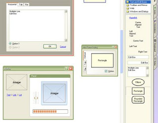
Das GUI Design Studio hat wie alle anderen Tools auch, eine Bühne auf der man seine Prototypen "zusammenschrauben" kann und eine Bibliothek aus der man einzelne Komponenten auf die Bühne ziehen kann.

Etwas unkonventioneller Weise, ist die Komponenten-Bibliothek rechts angeordnet. Man gewöhnt sich sehr schnell daran, aber es ist auf den ersten Blick doch etwas ungewohnt. Etwas unschön ist, dass die verschiedenen Reiter, der wirklich sehr gut ausgestatteten Library vertikal verlaufen und man immer leicht seinen Kopf neigen muss, um sie lesen zu können.

Aus Usability-Sicht ist das suboptimal und von solchen kleinen Fehlerchen welche die Anwendung nicht ganz flüssig ablaufen lassen und einen immer wieder zum Nachdenken zwingen, gibt es ein paar.

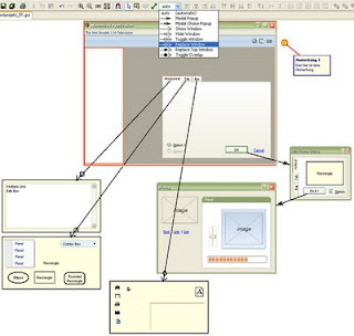
Um einzelne Wireframes oder Entwürfe miteinander zu verlinken muss nicht programmiert werden. Es werden ganz einfach ein paar Pfeile gezogen und fertig. Das Programm unterstützt den Anwender sehr gut bei dieser Aufgabe. Hinter den Pfeilen steckt jeweils eine bestimmte Funktion (zB: Neues Fenster oder Zeige Darüber - hier alles frei übersetzt :).

Die einzelnen Systemfenster (vom Wireframe) lassen sich in der Simulations-Ansicht ganz einfach auch wieder schließen (rotes Kreuzchen). Diese Funktion bringt das Programm bereits mit und muss nicht händisch implementiert werden.

Mit GUI Design Studio lassen sich Dokumentationen als HTML, PDF und RTF erstellen. Der Output ist nicht besonders schön aber auf jeden Fall brauchbar. Gerade in der PDF Variante versucht die Software wirklich ein halbwegs gutes Dokument hinzubekommen. Es gibt vernünftige Überschriften, ein Inhaltsverzeichnis und natürlich alle Bilder - alles automatisch importiert und generiert.

Zusätzlich zu GUI Design Studio kommt gibt es noch einen kostenlosen GUI Design Viewer der quasi eine abgespeckte Version des Design Studios ist (keine Library, beispielsweise). Mit ihm lässt sich das exportierte Projekt betrachten. Anmerkungen werden ebenfalls übernommen. Der Viewer zeigt zusätzlich zum Abspiel-Modus aber auch die Bühne an, was manchmal etwas zu viel des Guten sein kann. Schließlich soll der Kunde nur den fertigen Prototyp und nicht den komplexen Aufbau sehen. Am Aufbau verändern kann man im Viewer aber nichts.

Die Download-Seite ist erfreulich übersichtlich. Es gibt sogar eine Dokumentation - etwas, was man bei anderen Prototyping Tools oft vergeblich sucht.

Hier geht es zu einem kurzen Demo Video.

Fazit

GUI Design Studio wird wohl in absehbarer Zeit keinen Design-Preis gewinnen. Was das Programm aber leistet, ist auf jeden Fall einen Preis wert. Die Software ist sehr robust und durchdacht. Sie läuft einfach gut, nichts hakt oder macht irgendwelche Mätzchen.

Die Anwendung unterstützt alle Standard-Funktionen wie Rückgänig machen, in den Vordergrund bringen und so weiter... Zusätzlich gibt es eine Menge sehr guter Shrotcuts.

Besonders positiv: mit der Dokumentation hat man sich wirklich Mühe gegeben.

Eine Einzellizenz kostet $499 (knapp 355 Euro). Das ist nicht gerade billig, aber auch nicht wirklich überteuert.

GUI Design Studio ist wirklich gut und meiner Meinung nach, seinen Preis wert. Gerade, wenn man mit der "Programmierung" ein wenig auf Kriegsfuß steht und lieber Striche zieht als if-else Konditionen schreibt sollte man sich das Programm unbedingt mal ansehen.

Reviews

9. Juni 2009

Online Communities Handbook

Gestern kam mein neues Buch von Anna Buss und Nancy Strauss: Online Community Handbook: Building Your Business and Brand on the Web.

Viele von euch, liebe THS-Leser, werden Anna von den letzten IA Konferenzen her kennen. Sie ist eine erfahrene Informationsarchitektin und ich freu mich schon drauf, endlich ihr neues Buch lesen zu können...

To the Core

Ich bin eben über diesen Artikel von Luke Wroblewski gestolpert: Know Your Core: Providing Focus for Web Applications.

To stand out from the burgeoning number of products online and help your organization make the right decisions about what to build, it’s crucial to develop and stay focused on a clear value for your Web application that is distinct and obvious. In other words, you need to know your product’s core.

Sehr lesenswerter Beitrag.

Get better links

Hier ist ein ganz guter Beitrag aus dem Bereich SEO: 8 Tips to get Domain Diversity (with the anchor text you want).

As diligent Search Marketers know, it's quite a good idea to get links from strong/trusted sites pointing to yours, and combine this with building a single link or two from a large number of smaller websites.

Sind ein paar gute Tipps dabei.

8. Juni 2009

Amazon Treasures

Der aktuelle UIE Podcast ist wirklich hörenswert: Presentation Podcast: Revealing Design Treasures from the Amazon.

On its surface, Amazon.com just seems like a large e-commerce site, albeit a successful one. Its design isn’t flashy, nor is it much to write home about. But deep within its pages are hidden secrets — secrets that every designer should know about.

Es ist übrigens auch ganz lustig das Glucksen und Gackern von Jared Spool zu hören. Ist quasi so eine Art Gute Laune - Podcast.

Berlin IA Cocktail Hour

Hier nur ein kurzer Hinweis in eigener Sache: die nächste Berlin IA Cocktail Hour findet am 17. Juli (Freitag) statt...

Wo? Wird demnächst verraten.

Bong?

Das hier ist ein recht interessanter Artikel zum Thema Microsoft Bing: Searching for Bing? It’ll Be Baked Into TV and Online Fare.

In searching for ways to be “baked into the shows,” said Eric Hadley, general manager of worldwide marketing for search and MSN at Microsoft, the goal must be to get consumers to “say ‘Oh, wow’ ” and not “ ‘That’s it?’ ”

Konkurrenz ist ja immer gut, daher freue ich mich über Microsofts ernsthaften Versuch Google ein wenig die Stirn zu bieten. Meine Suchergebnisse waren bislang aber eher Bong als Bing - aber ich bin sicher, dass die Suche nach und nach besser wird.

7. Juni 2009

Save, Save, Save

Das hier ist ein kurzer aber sehr guter Blog-Post: Multiple Save Buttons.

Multiple save buttons are great to relieve bad karma from long and unfriendly forms. Just remember that the purpose of having multiple save buttons should be to make it convenient for the user to save their changes from anywhere on the page. Having section-specific Save buttons defeats this purpose.

Ach, wie wahr wie wahr.

Usability ROI?

Ich bin eben beim Frühsurfen über diesen interessanten Artikel gestolpert: eBusiness: How to argue usability investments to your CEO?

Altogether, arguing for usability investments should not exclude specific parts of your digital sales channel. If you invest in ease of use with a broader perspective, you can increase the user and customer experience by enabling people to find, understand and buy your products with less effort and in less time. Moreover, ease of access to your product landscape might allow decreasing your headcount of customer support and call-centre agents. A certain amount of usability ROI therefore also comes from increased total costs of ownership.

Ein wirklich guter Beitrag.

6. Juni 2009

Experience Strategy

Das hier ist ein sehr interessanter Artikel: What is an Experience Strategy?

An experience strategy is that collection of activities that an organization chooses to undertake to deliver a series of (positive, exceptional) interactions which, when taken together, constitute an (product or service) offering that is superior in some meaningful, hard-to-replicate way; that is unique, distinct & distinguishable from that available from a competitor.

Der Artikel ist garnicht soo lang, aber recht lesenswert.

5. Juni 2009

Usability Library

Liebe THS-Leser, das hier ist genau die richtige Wochenend-Lektüre: 15 Valuable Usability PDFs You Never Heard Of.

Here's a list of 15 valuable Usability Papers in PDF form that you might not have heard of, but should know and can use. This list is not meant to be comprehensive, rather, it's the list of the most thumb-worn papers I leaf through when needed. They are all free, and are publicly available.

In der Tat sind da ein paar sehr gute PDFs dabei...

Usability-Checklist

Hier ist mal wieder eine nette, kurze Liste für euch, liebe THS-Leser: 10 Tips to Create a More Usable Web.

Whether it’s your portfolio, a blog, a marketing web site, or a collection of games, we all want to attract visitors to our website and to ensure that they have a pleasant experience. Usability measures the level of a user’s experience and can be characterized by how easily a given task can be completed.

Eine wirklich brauchbare Usability-Checkliste... und abhaken, tut man do kurz vorm Wochenende immer gern, oder?

4. Juni 2009

Significant Usability

Auf usabilitynews.com ist ein guter Artikel erschienen: Caroline's Corner: Statistically significant Usability Testing.

If you take two different random samples, measure something about them, compare the measurements, and find a difference then the statistical tests of significance will help you to work out whether the difference you found could have come from the natural variation you get from any random sample, or because the two samples were genuinely different for some underlying reason.

Wirklich ein sehr interessanter Beitrag.

Good Design

Das hier ist ein ganz interessanter Blog-Post: Users Place More Weight on Design.

The demand for good web design is increasing, revealed a recent Webcopyplus online poll. Almost 25% of web users indicated "poor visual presentation" as the number one element that drives them away from websites. Only 6.6% of web users who participated in a similar 2007 online poll indicated "poor visual presentation" as the main reason to abandon a website. That equates to a 267% increase during the two-year period.

Lohnt sich mal kurz drüber zu lesen.

3. Juni 2009

Usability To-do List

Hier ist mal wieder eine schöne, kleine Usability-Liste:8 Tips for Maintaining a User Friendly Site in One Hour a Month.

With just a little extra work and a little extra maintenance, you can prevent the web weeds from creeping in and creating usability issues for your readers.

Die Tipps sind alle sehr brauchbar (wenn auch nicht unbedingt super neu :).

2. Juni 2009

Personas Library

Bei InfoDesign bin ich mal wieder seit langem über diese großartige Sammlung von Artikeln zu Personas gesolpert.

A persona is a user archetype you can use to help guide decisions about product features, navigation, interactions, and even visual design. [...] The usefulness of personas in defining and designing interactive products has become more widely accepted in the last few years, but lack of published information has, unfortunately, left room for a lot of misconceptions about how personas are created, and about what information actually comprises a persona.

Tolle Samlung - jetzt braucht man nur noch Zeit, das alles zu lesen...

Usability Comic

Wer sich für den Newsletter von Userfocus einträgt, bekommt kostenlos dieses 13 seitige Comic (als PDF): Usability Test Moderation: The Comic.

If you've been tasked with running a usability test, then you'll love this instructional guide. Aimed at people about to moderate their first usability test, this free graphic instruction guide covers the essential techniques you'll need to moderate a usability test.

Ist nicht besonders hübsch gezeichnet, sonst aber recht nett.

1. Juni 2009

UX Innovation?

Das hier ist ein ganz guter und kurzer Artikel: Innovation and User Experience.

User experience is closely related to insights into the customer. However, these are real insights based on problems they face, not blanket categories or market segment behaviours. We all know that there's probably a group of users with a name like "Millenials" or whatever, and then we can reel off a list of consumer research generalities about the group: impetuous, ambitious, attention-seeking, gadget lovers, blah de blah.

Der Beitrag wirft ein paar ganz interessante Fragen auf.

Mobile Commerce Usability - Part 3

Ich sehe gerade, dass der dritte Teil der mobile commerce design and usability Serie erschienen ist: Mobile Commerce Usability: Product Pages and Cart Summary.

The best online stores provide rich product descriptions, multiple image views, image zoom, review content and even product comparison tools. While it may not be optimal or even possible to include everything from the online store into the mobile site, care should be taken that product information presents the key benefits of the product/brand/make/model.

Einen weiteren Teil (den Vierten) soll es noch geben. Mal sehen, wann der raus kommt.