31. Juli 2010

Talking Cars

Mark Hurst, der Autor von Bit Literacy: Productivity in the Age of Information and E-mail Overload, erzählt auf seinem Blog eine interessante Geschichte: How customer experience killed the talking car.

I'll always remember the day I saw the talking car. It was 1983, and I was a fifth-grader who was always eager to try out a new digital interface. (The videogame arcade at the mall was the main venue for that, one quarter at a time.) Today, it was something especially interesting. A friend's dad had just bought a new Chrysler with the latest technology: speech. The car was in the driveway when I got there. And while my memory is hazy on some details - who actually opened the door and started the car, and what we talked about afterward - I'll never forget what the car said.

Nette weekend Lektüre.

30. Juli 2010

What could possibly go wrong?

Ich weiß wirklich nicht was ich von dieser Geschichte halten soll, aber irgendwie hört sich das nach dem Drehbuch für einen super spannenden Illuminati Teil 23 an: An Order of Seven Global Cyber-Guardians Now Hold Keys to the Internet.

A minimum of five of the seven keyholders – one each from Britain, the U.S., Burkina Faso, Trinidad and Tobago, Canada, China, and the Czech Republic – would have to converge at a U.S. base with their keys to restart the system and connect eveything once again. We’re imagining a large medieval chamber filled with techno-religious imagery where these knights cyber must simultaneously turn hybrid thumb drive/skeleton keys in a massive router, filling the room with the blinking light of connectivity.

Wow, die Liste der Keyholder ist klasse: USA, Burkina Faso, Trinidad, Tobago, China, Czech Republic - ich dachte immer das wäre die Liste mit den Schurkenstaaten ;) ...

Na ja, mal wieder ein Beitrag aus der Rubrik What could possibly go wrong?. Ich sag nur: Who you gonna call? Ghostbusters?

29. Juli 2010

Type of InfoGraphics

InfoGraphic Designs: Overview, Examples and Best Practices heißt eine gute Zusammenstellung über die ich neulich gestolpert bin.

Information graphics or infographics are visual representations of information, data or knowledge. These graphics are used where complex information needs to be explained quickly and clearly, such as in signs, maps, journalism, technical writing, and education. They are also used extensively as tools by computer scientists, mathematicians, and statisticians to ease the process of developing and communicating conceptual information.

Sind ein paar sehr gute Beispiele dabei.

28. Juli 2010

Usability Testing

Liebe THS-Leser, ich bin neulich beim Frühsurfen über diesen recht guten Blog-Beitrag gestolpert: Overcoming the Obstacles of Usability Testing.

In the past, usability testing meant getting people into labs, arranging testing sessions, utilizing eye-tracking cameras, and so on; clearly, high costs to go along with that. Times have changed, and the Internet has heralded a new generation of usability testing solutions. Some online services out there do charge a packet, there are other services out there that charge significantly less and are very affordable for any kind of project.

Gute Lektüre mit ein paar brauchbaren Anmerkungen.

27. Juli 2010

Looking at Search Trails

Das hier ist einer recht gute Lektüre: The Importance of the Journey: Search Trails and Destination Pages.

Looking at Search Trails may provide a whole different range of searcher behavior type information. By studying the pages that people travel down, from their selected page amongst search results to a final destination page, there may be information that can be related to that initial query that just isn’t captured by looking at query sessions and refinements alone.

Der Artikel enthält eine angeregte und ebenfalls lesenswerte Diskussion im Kommentarbereich.

26. Juli 2010

Podcast: Freelancer

Liebe THS-Leser, dieser Podcast wird Euch sicher interessieren, da viele von Euch Freelancer sind und sicher einige weitere es mal werden wollen: Selbständigkeit total.

Der Schritt in die Selbständigkeit birgt immer ein gewisses Risiko und sollte daher gut überlegt sein. Marcel Böttcher und Stefan Nitzsche geben einen Einblick in ihre fünf selbständigen Jahre und beantworten in zwei Stunden viele Fragen zum Arbeitsleben.

Ist wirklich mal wieder eine recht interessante Folge.

25. Juli 2010

Availability Bias

im Cooper Journal ist ein lesenswerter Beitrag erschienen: Combating availability bias.

If you’re involved in the design of products, you run into this problem all the time. Stakeholders use their own most easily-retrieved examples to compare against, whether it’s the CEO who is influenced by the pundit he read that morning, or the product manager who knows that one guy who is just like your target market, or the designer who is really designing for himself -- the self being the extreme “available example.” Availability biases leads to poor design decisions because they are based on single, potentially skewed, examples; they also result in thrash because each individual involved in the design has his or her own reference example, making consensus difficult.

Das angesprochen Problem ist nicht selten und sich dessen bewusst zu werden ist sicherlich schon mal ein Schritt in die richtige Richtung.

24. Juli 2010

High Five

Das hier, liebe THS-Leser, ist ein wirklich netter Usability-Post: A Brief History of the Magic Number 5 in Usability Testing.

Wondering about the origins of the sample size controversy in the usability profession? Here is an annotated timeline of the major events and papers which continue to shape this topic.

Hm, und was ist mit der Zahl Sieben?

23. Juli 2010

Endeca UI Pattern Library

Wir alle lieben ja UI Libraries... und da es erst 40 gibt, hat sich ENDECA gesagt wir machen auch eine. Und so kam es dann auch: Endeca User Interface Design Pattern Library.

The Endeca User Interface Design Pattern Library (UIDPL) describes principled ways to solve common user interface design problems related to search, faceted navigation, and discovery.

Die Bibliothek sieht sehr brauchbar aus und lohnt auf jeden Fall einen Blick.

Design and Architecture

Ab und an gibt es im DNA-Podcast immer ganz schöne Beiträge. Zum Beispiel ganz aktuell diesen hier: Action-Reaction: Design and Transformation.

Design's Biggest Fan: British inventor James Dyson has become a household name for his revolutionary line of bagless vacuums and the Air Blade, a more efficient, more sanitary way to dry hands in public restrooms. Now he's taking on the fan, or rather the Air Multiplier. Frances talks to him about what makes this bladeless fan a breath of fresh air for the design world.

Ich bin schon lange Fan von James Dyson. Vor allem diese coole, doppelläufige Waschmaschine wollte ich ja schon immer mal haben.

22. Juli 2010

FlipBoard

Auf IA Television gibt es ein interessantes Video zu dieser neuen super-duper App namens FlipBoard: Exclusive first look: A new kind of social media news reader: FlipBoard.

Via Ludwig bin ich über den dazu passenden Artikel gestolpert: Flipboard - the personal iPad magazine the web just fell in love with.

Flipboard plugs into Facebook and Twitter to figure out what you might be interested in seeing -- articles, photo albums, videos -- and updates dynamically to show you those things. It's a natural fit for the iPad, and the interface looks to be both beautiful and functional.

Ganz so überzeugt bin ich ja noch nicht von diesem dollen Tool. Mal sehen wie alltagstauglich es ist.

21. Juli 2010

Web Conferences

Manch einer von uns spielt ja ab und an mit dem Gedanken auch mal eine Konferenz zu veranstalten. So wie wir die deutsche IA Konferenz machen, oder die europäische EuroIA (die übrigens wieder ganz bald stattfinden wird. Zum Programm geht es hier), oder ein BarCamp wie das UXcamp beispielsweise.

Mit dem Thema Web Conferences befasst sich aktuell die The Big Web Show.

Dan Benjamin and Jeffrey Zeldman talk with Andy McMillan, founder of Build, an annual “hand-crafted web design conference” located in Belfast, Northern Ireland, and CSS godfather Eric Meyer, co-founder of An Event Apart, the design conference for people who make websites.

Recht interessanter Podcast.

20. Juli 2010

Single Page Design

Das hier, liebe THS-Leser, ist eine ganz nette Zusammenstellung: 40 Excellent Examples of Single Page Websites.

Several months ago, we published a list showcasing 40 Inspiring Single Page Websites, and as we had a lot of comments and everybody really loved the post, we decided to gather a new list, showing some new and fresh examples to inspire you. Single page websites are still a big hit this year, and we see new examples of this trend popping up everyday. To put this list together I was able to find many great examples on One Page Love, which is a great source for those who like to stay tuned in on the single page world. So enjoy the list…

Sind ein paar nette Beispiele dabei.

19. Juli 2010

Occam’s Razor (*zing*)

Heute Morgen beim rasieren, bin ich über diesen interessanten Beitrag gestolpert: Occam’s Razor: A Great Principle for Designers.

Designing simply for the web is about removing barriers. If a user wouldn’t know where to click, tell them. If there are too many navigational choices, eliminate some. If the background image distracts from the message, tone it down. In architecture, a cool design should not compromise the strength of the structure or make it difficult to get from point A to point B. Similarly, a cool web design shouldn’t compromise the clarity of the message you are trying to convey or make it difficult for the user to navigate from page A to page B.

Ein wirklich toller Montags-Artikel.

18. Juli 2010

Pedals, Wheels and Handlebars

Das hier ist ein recht lesenswerter Beitrag: Back to the Future...

The fascinating history of the automobile is remarkably similar to how personal computing appears to be evolving. Less than 100 years ago there were no standards with experimental contraptions controlled by levers, pedals, handlebars, wheels and a variety of power sources. Henry Ford succeeded in rolling up the best ideas of the day and developed [...]

Lohnt sich wirklich da mal beim Frühstück oder später im Cafe drüber zu lesen.

17. Juli 2010

Storytelling in UX

Auf einem meiner anderen Blogs habe ich einen Artikel angeteasert der Euch vielleicht auch interessieren wird: Storytelling with User Interfaces.

User interface design decisions don't tell a story on their own, but they can certainly keep a story from being told. The most important thing to keep in mind when determining the functionality of a page is the page's core purpose. Every additional widget or call to action on a page should either directly support or at least not overshadow it's main point. Those that do not are more likely to distract your readers than help them focus.

Schaut doch mal drüber, wenn Ihr Zeit habt.

16. Juli 2010

Website Navigation

Liebe THS-Abonnenten, das hier ist doch mal wieder eine brauchbare Liste, wa? 30 Examples of Excellent Website Navigation.

A website’s navigation allows visitors to get from page to page and discover content. That makes it pretty important, I would say. However, some designers feel the need to experiment and try to be clever with navigation design, but when getting around a website becomes a puzzle, visitors will more often leave frustrated. A website’s nav or menu should look like a nav. It should stand out while still matching the rest of the design, and it should be in a location where users expect it. So to give you some inspiration in this area, here are 30 Examples of Excellent Website Navigation.

Sind wirklich ein paar gute Beispiele dabei. Leider muss man sich ein wenig durchklicken...

THS Job Center

THS-Leser, das ist ja bekannt, sind gebildet, heiss und begehrt... aber das sagte ich diese Woche ja bereits.

Ich bin gebeten worden Euch auf folgendes Job-Angebot aufmerksam zu machen: Information Architect in Festanstellung aka: Senior Information Architect (m/w).

Kern Ihrer Aufgabe ist die Erstellung innovativer Konzepte für interaktive Applikationen zur Erreichung einer ganzheitlichen positiven User Experience unter Berücksichtigung der kundenspezifischen Anforderungen namhafter deutscher und internationaler Marken...

Soweit ich das Team kenne, sind alle super nett. Der Job wäre allerdings in Hamburg und nicht in Berlin - was natürlich kein Nachteil sein muss (ja ich weiß, dass hier korrekterweise ein m-dash kommen müsste).

Viel Erfolg beim bewerben.

15. Juli 2010

Perception of Forms

Auf Formulate ist mal wieder ein interessanter Blog-Beitrag erschienen: Perception and the design of forms – Part 3: Colour.

We are hardwired to be able to notice colour changes in our environment, and not just consciously, but without thinking. Things like this that are perceived without our conscious attention are said to be processed pre-attentively. [...] All three of our characteristics—shape, size and colour—are pre-attentively processed. Anecdotal evidence suggests, however, that colour typically has a greater impact on the overall design of a form than size and shape, both from a usability and an aesthetic point-of-view.

Guter Beitrag.

IxDA Berlin

Gestern war mal wieder IxDA Treffen in Berlin. Bei unglaublicher Hitze trafen sich doch einige Jungs und Mädels um einem guten Vortrag von Timm Kekeritz zu lauschen.

Types of Clients

Das Webdesigner Depot identifiziert 7 Personality Types of Clients Today.

Designers and developers form two parts of the design trinity: the client completes it. You can have the technology to build something and the design to make it magnificent, but if someone doesn’t fund the project, it usually falls flat. No one has the time to do such a thing for fun. Designers and developers need clients to build their portfolio, sustain their lifestyle and grow and learn. Not all clients are difficult, so we’ll try not to stereotype. But in all honesty, the perfect client needs no introduction or description. The perfect client is rare, though not extinct.

Na, erkennt ihr in dem Artikel jemanden wieder? Lustig und lesenswert.

THS Job Center

THS-Leser, das ist ja bekannt, sind gebildet, heiss und begehrt.

In diesem Zusammenhang erreichte mich gestern folgende Anfrage: Wir suchen eine/n Konzepter/-in.

Warum, woher und auf welchen Wegen kommen Menschen zu einem Web-Angebot? Welche Erwartungen und Erfahrungen bringen sie dabei mit? Wie können wir mit ihnen ins Gespräch kommen und sie reibungslos zum Ziel führen – und sie dabei nachhaltig überzeugen und begeistern? Diese ganzheitliche Sichtweise des Nutzungserlebnisses rund um die Internet-Angebote unserer Kunden ist uns wichtig – egal, ob sich das nun auf einer Website, in einem sozialen Netzwerk oder über eine Handy-Applikation abspielt. Denn am Ende ist es immer der Mensch und seine Bedürfnisse, der den Erfolg von digitaler Kommunikation bestimmt.

Viel Erfolg beim bewerben.

14. Juli 2010

Prioritizing Content

Das hier ist doch mal wieder eine wirklich gute Lektüre, wa? Content Organization: Deciding What Matters Most.

High quality content, regardless of whether the site aims to inform, entertain, or sell a product, will increase the site’s likelihood of converting visitors. But beyond providing high quality content, a site also needs to organize that content in a way that makes it accessible to visitors. Prioritizing your content is one of the best ways to make sure your visitors are finding the information you want them to find, and that they want to find. But figuring out what content is most important and how to arrange it to reflect that can get confusing, fast.

Der Text enthält einige gute Beispiele.

Best iPad Apps

Liebe iPad Benutzer out there, das hier wird Euch evtl. interessieren: 10 Best iPad Apps for Web Designers.

If you’re a web designer and own an iPad, I’ve got great news. There are apps out there that will actually help you be productive. So while you’re away from your desk or office, take a break from playing Angy Birds and get some work done. Here are 10 of our favorite iPad apps to help you do just that.

Sind sicher einige coole Apps dabei... wobei mir noch immer nicht klar ist, wozu man das iPad braucht.

13. Juli 2010

Bridge the Gap

Ich bin neulich über diesen recht lesenswerten Artikel gestolpert: Event Style Usability Testing.

Usability testing is often used for getting feedback or benchmarking the usability of key task flows of a product or service. These key tasks are discrete and isolated to make it easier to get more quantitative data, but this comes at the cost of losing what the natural workflow may be since a structure or order is enforced. The natural workflow is something that is researched through more contextual methods. What we wanted for this project was to be able to allow a natural workflow that would allow users to use multiple tools and do things that were not expected by the product team while being able to get metrics such as time, errors, assists, and perceived usability. With this in mind, we created a method that we’ve dubbed internally as Event Style Usability Testing to help bridge this gap between usability testing and contextual/ethnographic studies.

Zum Thema Usability - sicherlich für einige THS-Leser interessant.

Experts at Work

Der Frage What is an Expert Usability Review? geht dieser besagte Blog-Post nach.

Whilst the Heuristic Evaluation is a common method used in more formal or academic circles, it could be argued that this method is too rigid and often fails to meet the needs of most clients. Assessing an interface by simply checking boxes to determine where it does or does not meet so called usability guidelines does not place enough value upon the context of use, or the goals of the system. The evaluation relies solely upon usability guidelines that are often years old and the result of research on graphical user interfaces, which may be completely different to the one being reviewed.

Netter Artikel.

12. Juli 2010

Reusable Solutions

Ich glaube diese Liste noch nicht gebloggt zu haben: 40+ Helpful Resources On User Interface Design Patterns... zumindest kann ich mich jetzt gerade nicht erinnern.

If there is a commonly reoccurring need for a particular solution, there is a great probability that someone has – by now – solved that need and has finished the legwork involved in researching and constructing something that resolves it. At the very least, you will find documentation on general solutions to related problems that will enable you to gain insight on best practices, effective techniques, and real-world examples on the thing you are creating. A design pattern refers to a reusable and applicable solution to general real-world problems. For example, a solution for navigating around a website is site navigation (a list of links that point to different sections of the site), a solution for displaying content in a compact space are module tabs.

Schöne Sammlung, die auf jeden Fall einen Blick lohnt.

Failure 99% good

Das hier ist mal wieder ein interessanter Blog-Beitrag: The Value of Failure.

Trying to get it right the first time isn’t a good idea. My experience with some development teams makes me think there is a school of thought that believes that getting the ‘code’ right the first time, even with the first prototype, saves on development costs. My experience has been otherwise.

Der Artikel spricht einige echt gute Punkte an.

11. Juli 2010

Topic Maps

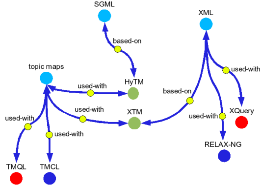
Das hier ist eine großartige Sonntagslektüre, liebe THS-Leser: Metadata? Thesauri? Taxonomies? Topic Maps!

To be faced with a document collection and not to be able to find the information you know exists somewhere within it is a problem as old as the existence of document collections. Information Architecture is the discipline dealing with the modern version of this problem: how to organize web sites so that users actually can find what they are looking for. Information architects have so far applied known and well-tried tools from library science to solve this problem, and now topic maps are sailing up as another potential tool for information architects. This raises the question of how topic maps compare with the traditional solutions, and that is the question this paper attempts to address.

Der Artikel ist wirklich ziemlich umfangreich, aber auf jeden Fall sehr lesenswert.

SEO and IA

Eine interessante und lesenswerte Sonntagslektüre ist der Artikel: Information Architecture – Rocket Science Simplified.

Well, it may not matter to you. But to me, it’s about finding every way possible to squeeze out as much SEO value as possible while not completely sacrificing the user experience. And for sites like this client example, where I’m paid in an ongoing contract to continually come up with additional ways to improve the bottom line financially for my client, I can achieve more long lasting results in less time by addressing this topic than I can by obtaining links that may or may not one day be useless, or even harmful. Because at the end of the day, the site’s internal information architecture factors will always be factors. And while they may be less of a factor some day, the only way to compare apples to apples is not just with inbound link or external mention authority, but down and dirty on-site considerations.

Guter Beitrag.

10. Juli 2010

Most Influential Papers

Liebe THS-Leser, das hier ist wirklich mal eine wunderbare Wochenendlektüre: The Five Most Influential Papers in Usability.

I compiled a list of papers that have had a large and lasting influence on the field of Usability and User Experience. I then asked Jim Lewis and Joe Dumas, two pioneers in this field for their top five. There was considerable overlap in both the papers and topics suggesting that while there may be some disagreement with the conclusions of the papers there is strong agreement on their impact.

Da ist wirklich einiges lesenswerte dabei.

9. Juli 2010

Basecamp Redesign

Mit dem Basecamp home page redesign befasst sich dieser gleichnamige Artikel.

A few weeks ago we decided to take a stab at redesigning the Basecamp home page. We liked the current design, but we wanted to see if we could do better. Specifically we were interested in more visuals, less text, and a generally simpler and less dense presentation. As we usually do, we start with a very low-fi sketch of the big idea behind the design. No details, no words. Just a very rough idea. In this case the idea was a series of scenarios all pointing back at the Basecamp logo. The original sketch, done in Draft and shared in Campfire

Der Text wird sicherlich nicht nur Basecamp Nutzer und 37signals (Buch: Getting Real: The Smarter, Faster, Easier Way to Build a Successful Web Application) Fans interessieren.

8. Juli 2010

HTML5 with Jeremy Keith

Ich bin ja ein großer Fan der Big Web Show geworden. Weil ich mich rückwärts durch die bereits erschienenen Folgen durcharbeite, bin ich jetz bei Folge 2 angelangt: HTML5 with Jeremy Keith.

Dan and Jeffrey talk with Jeremy Keith, designer, writer, speaker, and author of HTML5 for Web Designers, a new book coming out in June of 2010. They discuss the goals and inspiration behind the book, as well as what HTML5 means for both web creators and those who consume the web, covering topics that range from structure to accessibility and implementation.

Eine wirklich hörenswerte Episode. HTML5 geht uns als IAs und UX Profis schließlich alle an.

Jeremy Keith ist Autor des Buches Dom Scripting: Web Design with JavaScript and the Document Object Model.

Jeffrey Zeldman ist natürlich der Autor des Klassikers Designing with Web Standards .

7. Juli 2010

Design Thinking

Neulich bin ich über diesen alten (immerhin von 2007) aber irgendwie noch immer recht aktuellem Post gestolpert: Design Schools: Please Start Teaching Design Again.

I was taught that design has three components: thinking, making, and doing. (Doing is the synthesis, presentation, and evaluation of a design; the bridge between thinking and making.) If all design schools are teaching is the thinking, well, they are missing the other two thirds of the equation. They have abandoned craft for craze. Thinking without the making and doing is almost useless in the job market, unless you want to work at Accenture or some other big consulting firm. It probably won’t help you get a job as a designer in a studio environment. You’d be better off getting a degree in Humanities; at least you would be well-rounded. D schools are doing a serious disservice to their students by only teaching them “design thinking” when a class in typography or mechanics or drawing might not only give them a valuable skill, but also teach them thinking and making and doing — all at the same time. For design to be truly useful as a profession and as a discipline, designers can’t just use “design thinking” to come up with strategies and concepts.

Der Beitrag bringt ein paar sehr interessante Punkte an.

Complex Tasks

Im UX Magazine ist mal wieder ein guter Artikel erschienen: The Dirtiest Word in UX: Complexity.

Simplicity allows many applications to be powerful. The UIs are not clouded with unnecessary controls. They are focused on specific tasks and don’t get in the way by forcing the user to do too much at once. There are some occasions, though, that the normal workflow for a particular set of users is complex. Therefore, it can be expected that the application that controls these types of tasks will be more complex. In fact, a complex UI can sometimes be exactly what the user needs. For example, a dashboard that displays visualizations of large data sets can only ever be complex because its purpose is complex.

Ein guter Beitrag. Haben wir nicht alle ab und an mit sehr komplexen Apps oder Webseiten zu kämpfen?

6. Juli 2010

Neulich im Zug

Neulich im Zug. Wenn das Klo-Zeichen leuchtet, ist das WC besetzt. Was ist wenn das Restaurant Symbol auch leuchtet? Ist das Board Bistro dann auch voll?

Immerhin leuchtet das Nichtraucher-Zeichen nicht. Offenbar sind keine Nichtraucher im Zug.

Da hole ich einfach mein Nokia heraus, öffne den Mac und surfe via Bluetooth drauf los. Das nennt sich Tethering. Das kann das iPhone nicht. Dafür siehts aber super aus.

...und es kann für Internet Explorer 6 optimierte Seiten super anzeigen. IE6? 2001? Da gabs schon Flash 5. Ist auch schon wieder 9 Jahre her. Flash hats aufs iPhone noch nicht geschafft.

Die MMS (Multimedia Messaging Service) auch nicht.

Ich überlege schon die ganze Zeit, ob ich mir ein Android Handy hole oder doch noch auf MeeGo warte.

Free Download: Usability of iPad Apps

Bogo (von Bovacon) hatte mich auf diesen Bericht von Jakob Nielsen hingewiesen: Usability of iPad Apps and Websites.

This report is based on usability studies with real users, reporting how they actually used a broad variety of iPad apps as well as websites accessed on the iPad. We are making this report available for free to support our loyal audience of usability enthusiasts by providing them with early empirical data about iPad usability. This report is less thorough than our normal research reports and does not contain as many detailed and actionable design guidelines as we usually provide. We decided to publish the report anyway (as a donation to the community) because all experience from the last 30 years of usability shows that early usability findings have disproportionally large impact on design projects.

Ich hatte über den kostenlosen Report zwar schon getweetet - aber vergessen ihn auch hier für Euch zu bloggen. Tja, ich bin halt auch nicht mehr der Jüngste...

5. Juli 2010

Stop Designing Alone

Das hier, liebe THS-Leser, ist ein wirklich guter Blog-Post: Why Agile UX is Meaningless without an Agile Attitude.

For a number of reasons, many UX designers are strongly conditioned to design alone. This unfortunate yet common pattern is perhaps the single greatest obstacle in allowing for developing an Agile attitude. Among its many detriments is that it perpetuates an Us/Them mindset and that it makes ritual-free rapid communication, a cornerstone of Agile, nearly impossible. A common working-alone pattern is to first gather information from team members and stakeholders, and maybe do a bit of whiteboarding with the team, and then go off and create the “real” design in your cubicle with your headphones on.

Sehr lesenswert - nicht nur für THS-Leser, die sich für Agiles-Zeugs interessieren.

Crush It!

Ich habe am Wochenende Crush It!: Why NOW Is the Time to Cash In on Your Passion zu Ende gelesen. Ein wirklich sehr inspirierendes Buch.

Gary Vaynerchuk has captured attention with his pioneering, multi-faceted approach to personal branding and business. After primarily utilizing traditional advertising techniques to build his family′s local retail wine business into a national industry leader, Gary rapidly leveraged social media tools such as Twitter and Facebook to promote Wine Library TV, http://tv.winelibrary.com, his video blog about wine. Gary has always had an early-to-market approach, launching Wine Library′s retail website in 1997 and Wine Library TV in February of 2006. His lessons on social media, passion, transparency, and reactionary business are not to be missed!

Für alle, die das Thema personal branding interessiert. Ein wirklich lesenswertes Buch.

Alle, die lieber lange ausschlafen und im Leben eh nichts mehr reissen wollen, können dieses Buch getrost ignorieren.

4. Juli 2010

What is Interaction Design?

Das hier ist ein kurzer, aber recht interessanter Beitrag von Dave Malouf: What is IxD and What does an Interaction Designer Do? Discuss!

What is Interaction Design? Interaction Design is a multi-disciplinary design discipline that uses human understanding to manage the growth of complexity due to but not limited in scope to technology.

Die Kommentare sind ebenfalls lesenswert.

3. Juli 2010

UX Myths

Liebe THS-Leser, das hier ist eine ganz nette Seite: UX Myths.

UX Myths collects the most frequent user experience design misconceptions and explains why they don't hold true. And you don't have to take our word for it, we'll show you lots of researches and articles from design and usability gurus.

Lohnt sich auf jeden Fall da mal kurz drüber zu lesen.

2. Juli 2010

EuroIA 2010 in Paris

Jeden September findet ja die EuroIA Konferenz statt. Jedes mal in einer anderen europäischen Stadt. Letztes Jahren waren wir alle in Kopenhagen, davor Amsterdam, davor Barcelona, davor Berlin... und so weiter. Und wo ist es dieses Jahr? In Paris. Ist das nicht klasse? Hier gehts zum Programm.

Interaction designers should learn from product designers. And in that sense Japan is a little paradise. As much trouble as the Japanese economy is facing, Japanese product design is in many ways still a paradigm of craftsmanship, consideration and care.

Die Keynote hält dieses Jahr Oliver Reichenstein. Hier ist ein nettes Interview mit ihm: Interview with iA’s Oliver Reichenstein.

Als EuroIA Country Ambassador Germany freut es mich sehr, so viele Deutsche Kollegen und bekannte Gesichter unter den Rednern zu sehen. Großartig. Ich bin überzeugt, dass es eine super Konferenz werden wird. Mal wieder.

1. Juli 2010

Good Web Design Reading

Im DesignReviver ist eine schöne Auflistung erschienen: Four Web Design Articles Well Worth Reading.

As web designers we all love searching for great new resources, browsing some useful and relevant tutorials and we especially love them as most are free. Sometimes though, we need something more, something that will set your mind alight and for you to consider it a darn good read. And that is what we have found for you today, four web design articles that are well worth your time. So, grab yourself a cup of coffee and take the time to enjoy them.

Na, da ist das Wochenende doch schon gerettet. jetzt muss es nur noch regnen...